



What Color Rug Goes With Yellow Curtains? A Rug Specialist’s Pairing Guide
October 31, 2026
Area Rug vs Throw Rug vs Runner: What Is the Difference Between Rug and Runner?
November 3, 2026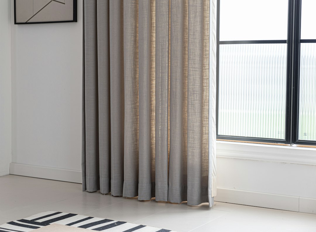
Do curtains and rugs have to match? After years of cleaning, repairing, and restoring textiles, my answer is no, but the two must relate. Almost every week a client unrolls a rug on my washing floor, shows me a phone photo of their window treatments, and asks exactly that. This guide explains the difference between matching and coordinating. It covers color relationships, light, and fabric weight, then compares living room and bedroom pairings. It also shows how fading and cleaning change a pairing years after you commit to it. Learn more about Rug Cleaning.
Key takeaways
- Curtains and rugs do not have to match, but they should share a visible relationship such as undertone, accent hue, or warmth.
- Coordinating works better than matching because pieces in the same hue, value, and saturation flatten the room and expose every small difference.
- Fiber affects dye, so a wool rug and a linen drape ordered in the same named color will often look different.
- Four color relationships work well: analogous, complementary, tonal, or a neutral anchor where one piece is neutral and the other carries color.
- Successful pairings usually differ in texture, sit two to three steps apart in value, and put a large-scale pattern on only one piece.
Matching rugs
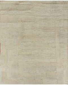
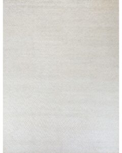
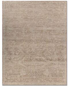
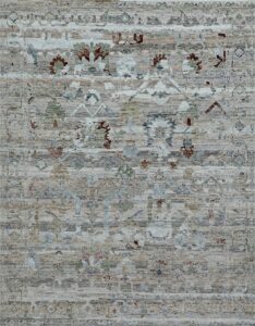
These rugs share undertones and accent hues with common drapery colors, so they relate to your window treatments without matching them exactly.

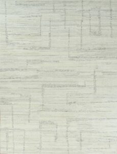
Do Curtains and Rugs Have to Match, or Just Work Together?
Curtains and rugs do not need to share a color, a pattern, or a collection. They need a visible relationship. That relationship can come from a shared undertone, a repeated accent hue, or matching warmth. A deliberate contrast inside one palette also works. A room where the drapery and floor covering share two colors but differ in scale and texture almost always looks more considered than one where the two are identical.
Eye behavior explains the rule. Drapery fills a vertical plane, often 84 to 96 inches tall. An 8 by 10 foot rug covers 80 square feet of horizontal surface. The two planes meet at the floor line. When both wear the same saturated color, the room loses its visual boundaries. Designers aim for cohesion rather than duplication, and many apply the 60-30-10 proportion rule: one dominant color on about 60 percent of surfaces, a secondary color on 30 percent, and an accent on 10 percent. The rug or the curtains typically carries the secondary share, not both.
What Separates Matching From Coordinating Curtains and Rugs?
Matching means the drapery and the rug share the same hue, value, and saturation, so they register as one material choice. Coordinating means they belong to one scheme but differ in at least one of those three properties. Coordinated pairs tolerate dye lots, fading, and soil far better than matched pairs.
Fiber chemistry makes the workshop consequence obvious. Wool takes dye differently than cotton, linen, or polyester, so a rug and a curtain ordered in the same named color from two manufacturers will diverge. A “sage” wool pile may lean yellow-green, while a “sage” linen drape reads gray-green because flax scatters light. Coordinating from the start avoids a mismatch that only appears after installation. These are the signals I look for in a successful pairing:
- Hue family: one shared family, such as terracotta in the rug border echoed by rust piping on the drape.
- Warmth: both warm (yellow or red undertones) or both cool (blue or gray undertones).
- Value gap: two to three steps apart on a ten-step light-to-dark scale.
- Texture: different surfaces, such as cut wool pile against smooth sateen or slubbed linen.
- Pattern: a large-scale pattern on only one of the two pieces.
Why Does an Exact Match Between Curtains and Rugs Backfire?
A pairing that matches too closely flattens the room, shrinks its apparent size, and exposes every tiny difference between the two pieces. When a rug and curtains share the identical navy, the eye finds no horizon line. The furniture appears to float in a dark box. Any dye variation then reads as an error rather than a design decision.
Plain charcoal wool beside charcoal velvet panels shows the problem clearly. The room gives the eye nowhere to rest. Clients who want a quiet, tonal look do better with a rug a few shades lighter or darker than the drapery, plus surface interest from a high-low pile or a subtle geometric. Many Contemporary & Modern Rugs that hold up in tonal rooms separate themselves from walls and windows through texture rather than color. The same principle solves the “too matched” problem.
How Should Color Theory Guide a Rug and Curtain Pairing?
Color theory offers four workable relationships between a rug and a curtain. Analogous schemes use neighboring hues on the color wheel. Complementary schemes use opposite hues. Tonal schemes use one hue at different values. A neutral anchor puts one piece in a true neutral and lets the other carry the color. Any of the four can succeed without the textiles being identical.
The Munsell color system, which most decorators’ hue wheels descend from, separates hue, value, and chroma into independent dimensions. That separation lets you hold one property constant while varying another. Keep the hue family and shift the value, and the pairing reads calm. Keep the value and choose complementary hues, and it reads energetic. Rugs dyed with natural indigo and madder carry this variation internally through abrash, the gentle banding that appears when a weaver changes dye lots. After washing thousands of rugs, I find they coordinate with drapery more forgivingly than flat, single-lot synthetics.
Which Color Schemes Make Drapes and Rugs Look Intentional?
Five schemes account for most of the successful rooms I see, and each carries a specific risk. The table below compares them on how the rug relates to the curtains, hue separation, ideal setting, and main hazard.
| Scheme | How the rug relates to the curtains | Hue separation on a 12-step wheel | Best suited to | Main risk |
|---|---|---|---|---|
| Tonal / monochromatic | Same hue, rug 2-3 value steps lighter or darker | 0 steps | Bedrooms, small rooms, minimalist interiors | Flatness if values are too close |
| Analogous | Neighboring hues, e.g. teal curtains with a blue-green rug | 1-2 steps | Living rooms with a relaxed, layered feel | Muddiness if warmth differs |
| Complementary | Opposite hues, e.g. rust drapes with a slate-blue rug | 6 steps | Formal living and dining rooms | Visual competition if both are fully saturated |
| Neutral anchor | One piece in ivory, oatmeal, or charcoal; the other carries color | Not applicable | Rooms with strong art or upholstery | Dullness if the neutral has the wrong undertone |
| Pattern echo | Rug pattern contains one hue repeated in the curtain | Any | Traditional and transitional rooms | Chaos if both pieces are patterned at the same scale |
Undertone decides whether any scheme works. A gray that leans violet and a gray that leans green share a catalog name but fight on the floor. I lay a drapery swatch directly on the rug in north daylight, then again under the room’s own lamps. When the drapery is already a strong color, our guide on what color rug goes with yellow curtains shows how these schemes play out with a specific hue.
How Do Light and Fabric Weight Change Curtain and Rug Colors?
Light source and fabric weight shift perceived color more than most people expect, which is why a showroom pairing can look wrong at home. Warm bulbs around 2700 to 3000 Kelvin push both textiles toward yellow. Daylight near 5000 to 6500 Kelvin pulls them cooler. Dense wool pile absorbs light and looks deeper than its dye suggests, while a sheer curtain transmits light and looks paler.
Drapery weight is the variable people forget. A linen sheer at 150 to 200 grams per square meter filters sunlight and tints the whole room, rug included. A lined cotton velvet at 450 to 600 gsm blocks most light and reads as a solid color block. Light Reflectance Value, the paint industry’s 0-to-100 scale where 0 is absolute black, offers a useful shortcut. A rug under LRV 20 beside drapes above LRV 60 produces strong contrast. Keeping both within 15 points of each other produces a soft, tonal effect.
More matching rugs
Another set of rugs that follow the same colors and style as this guide.

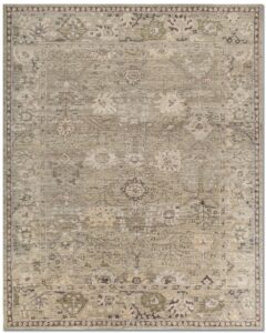

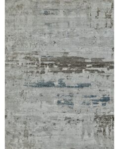
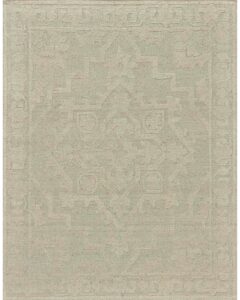
How Can You Match Curtains and Rugs in a Living Room?
Living room pairings work best when one piece acts as the focal point and the other supports it through a shared secondary color. Living rooms carry the most furniture, the most foot traffic, and usually the largest rug in the house. The rug tends to earn the leading role, while the drapery picks up one or two of its hues.
Scale creates the practical challenge. A living room rug commonly measures 8 by 10 or 9 by 12 feet and sits under a sofa, two chairs, and a coffee table, so only 50 to 70 percent of its surface stays visible. Drapery stays fully visible and often spans two or three windows. When both pieces compete, the room feels crowded before the furniture arrives. Let the rug set the palette, then choose curtains in its calmest secondary color.
Should the Rug or the Curtains Set the Living Room Palette?
The rug should set the palette whenever it is hand-knotted, antique, or richly patterned, because those rugs cost more and are harder to replace than drapery fabric. The curtains should lead only when they already hang in a strong color the homeowner will not change. In that case, select the rug to complement them.
Traditional patterns make the decision easy. A Persian Heriz with a rust field, navy medallion, and ivory spandrels already contains a complete scheme, so ivory or muted navy drapes let the rug do the work. Many pieces in our Classic & Traditional Rugs category use four to seven colors so a room can borrow secondary and accent hues. When a client already has bold red drapery hung, I pull a cooler, lower-chroma rug so the window stays the star. Our guide on what color rug goes with red curtains covers those combinations.
Why Do Rug and Drape Patterns Clash at the Same Scale?
Rugs and drapes clash when their patterns repeat at a similar scale, even if the colors agree. Two medium-scale florals, one on the floor and one at the window, create visual noise. Pair a large-scale pattern on one piece with a solid or fine texture on the other, and the room stays readable.
A central medallion on a 9 by 12 rug often spans 36 to 48 inches, while a kilim’s geometric repeat may sit at 4 to 6 inches. Drapery prints usually repeat every 12 to 27 inches. Choose one of those scales to dominate. Flatwoven pieces with tight geometric repeats, such as those in our Kilim Rugs collection, pair comfortably with solid linen or wide-stripe drapes. A large-scale ikat or botanical drapery fabric needs a rug with quiet, overall texture instead of a second pattern.
Is a Curtain and Rug Set a Good Idea for a Bedroom?
A curtain and rug set can work in a bedroom, but a pre-coordinated set is rarely the best route. Bedrooms are smaller, more enclosed, and lit mainly by lamps. Tonal and analogous schemes outperform exact matches there. A rug a few values lighter than the drapery, in the same hue family, delivers the restful effect people want without the flatness of a duplicate.
Bedroom rugs sit in a different position than living room rugs. They typically extend 18 to 24 inches beyond the sides and foot of the bed. A 6 by 9 or 8 by 10 rug under a queen bed therefore shows mostly as two side runners and a strip at the foot. Little surface remains visible, so a subtle rug reads as a soft frame for the bed. The curtains then carry whatever color interest the room needs.
When Should Bedroom Drapes and Rugs Differ on Purpose?
Bedroom curtains and rugs should differ deliberately in three cases: strong direct sun, patterned bedding, or a wish to make the window treatment disappear into the wall color. Tying the rug to the drapery in those rooms would either expose uneven fading or add a third competing pattern.
Blackout-lined drapery blocks roughly 99 percent of visible light and is usually chosen for function in neutral colors. A patterned rug beneath the bed, such as a soft Gabbeh with a tribal motif or a vintage Oushak in faded apricot and gray, can supply the only color the room needs. I often recommend wall-matched neutral drapes so the rug and bedding carry the scheme. That choice keeps the window from becoming a hard color edge in a room meant for sleep.
How Do Fading and Cleaning Pull a Rug and Curtain Set Apart?
Fading and cleaning separate a matched set within a few years, because wool, cotton, linen, and polyester lose color at different rates. Drapery hangs in direct light and fades fastest along its leading edges. The rug fades in the strip nearest the window while staying darker under the bed. Pieces that started identical end up visibly different, which is another argument for coordinating.
Lightfastness is measured on the blue wool scale in ISO 105-B02, which runs from 1 (very poor) to 8 (excellent). Typical ranges I see in the workshop:
- Chrome-dyed wool rugs: often 6 or higher.
- Printed cotton and linen drapery: commonly 4 to 5.
- Rotation interval for bedroom rugs: 180 degrees every six to twelve months.
Professional Rug Cleaning restores a soiled rug’s true color and often reveals that the drapes, not the rug, have drifted. Lining or interlining slows drapery fade, but the two textiles never age in lockstep.
What Common Mistakes Make Curtain and Rug Pairings Fail?
One decision rule settles most pairings: share one property, vary the other two. Share the undertone, then separate the value by two to three steps, then separate the texture or pattern scale. A pairing that follows this rule survives dye differences, fading, and lighting changes. A pairing that shares all three properties breaks the moment either piece ages.
Four mistakes cause most failures I am asked to diagnose:
- Matching by catalog color name: fibers and dye lots make identical names look different on site.
- Judging under store lighting: a 2700 K lamp at home shifts both textiles toward yellow.
- Ignoring the sheer: a tinted sheer casts its own color across the rug.
- Pairing equal patterns: two medium-scale prints compete rather than cooperate.
Each mistake has a cheap fix. Test swatches in the room, check them at three times of day, and change the curtains before the rug.
What Has Hands-On Experience Taught Me About Matching Rugs and Curtains?
Years of washing and repairing rugs in finished homes have taught me that rooms coordinated through a shared undertone outlast rooms matched exactly, both visually and practically. The pairings that still look right a decade later share a pattern. The rug had several colors to offer, and the drapery borrowed just one of them.
One Denver job stays with me. The client owned a 9 by 12 antique Mahal in soft brick, camel, and faded indigo. They had ordered custom brick-red velvet panels to match the field, and the room felt heavy and dim. After cleaning, the rug’s camel ground brightened considerably, and the velvet looked darker and redder than the field it was meant to echo. The client swapped the panels for camel linen that picked up the rug’s lightest color. The brick in the rug then read as the accent it was designed to be. Nothing about the rug changed; only the relationship did.
What Do I Check Before Advising Clients on Pairing Curtains and Rugs?
Five checks come before any advice: the undertone of both textiles under the room’s own lighting, the value gap between them, the fiber content, the direction and intensity of sunlight on the rug, and whether either piece is patterned at a competing scale. Those five factors predict whether a pairing holds up better than any fabric tag.
Seeing the rug in the actual room beats every swatch and photograph. Phone cameras auto-correct white balance and often shift a warm ivory toward cool white, which is why rugs chosen from images disappoint beside real drapery. Our Try Rugs at Home service exists for this reason. Unroll two or three candidates beneath the curtains and view them at 9 a.m., at noon, and under lamps after dark. I also advise living with any new combination for a full week, since the eye adjusts and first impressions mislead.
Final picks
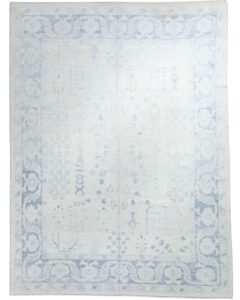
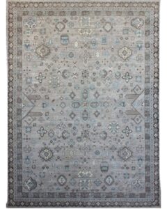
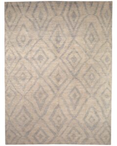
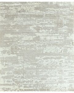
One last row of rugs chosen to go with the ideas above.
FAQ: Questions About Matching Curtains and Rugs
Homeowners ask the same handful of questions once they accept that exact matching is optional. The answers below apply the rules from this guide to common room situations.
Each answer gives the short verdict first, then the reasoning a rug specialist would offer on site.
Must Curtains and Rugs Match in a Small Apartment Living Room?
Small apartment living rooms do not require matching curtains and rugs. A tonal scheme, with the rug two or three value steps lighter than the curtains, makes the space feel larger and more unified.
Exact matches tend to shrink a compact room. Keep both pieces in the same warm or cool family and let texture, not color, separate them.
Should Rugs and Curtains Be the Same Color With White Walls?
White walls give you room to vary rugs and curtains, so identical colors are unnecessary. A patterned rug with drapes in one of its secondary hues works well, as does a neutral rug under colored drapery.
Check the white’s undertone first. A warm white beside cool gray textiles can look dingy.
Can a Matching Curtain and Rug Set Look Dated Quickly?
Pre-matched curtain and rug sets often age poorly, because the two fabrics fade and soil at different rates. Identical colors also lock the room into one look.
Buying the rug first and choosing drapery from one of its colors lets you change the curtains later without replacing the rug.
Which Is Easier to Change When a Pairing Feels Wrong?
Drapery is usually the easier and cheaper change, especially when the rug is hand-knotted. Lined custom panels cost a few hundred dollars as a rough estimate, while a quality wool rug is a far larger investment.
Adjust the curtains first, unless the rug is genuinely the wrong size or style. Cleaning also matters: soil grays a rug’s colors, so a washed rug often looks a shade brighter, and you should reassess the pairing afterward.
